
About
Existing friend-finding apps can feel too formal, while platforms like Meetup often lack trust or immediacy, an issue made more urgent by the growing “loneliness epidemic.” JoinMe bridges this gap by helping people connect authentically through shared interests, making it easy to find and join real-life plans based on common interests and skill levels.
My Role
From Oct 2023 to Aug 2025, I served as the UX Designer, leading end-to-end product design from development through App Store launch in a fast-paced startup, collaborating closely with founders and developers.
Status
Launched on App store May of 2025, project has been discontinued due to funding.
Jump to…
Problem
Young adults are experiencing rising loneliness, with reports like the U.S. Surgeon General highlighting a growing social disconnection crisis.
The current market space is dominated by platforms like Bumble BFF and Meetup. However, they often feel:
Awkward, depending on user-led planning with strangers, creating friction
Too similar to dating
Unclear or unsafe in real-world settings
User Feedback
“Friend-finding apps feel more like a date, and it’s awkward.”
Despite wanting connection, users struggle to translate intent into natural interaction.
Opportunity
Design a social experience that removes social friction by centering connection around pre-planned activities instead of open-ended coordination.
Instead of “what should we do?”, users:
Join pre-formed, specific plans
Match based on shared skill level + interests
Enter interactions with built-in common ground
User Feedback
“It gives us automatic common ground and something to talk about.”
This shifts the experience from meeting strangers to doing something together; making connection feel more natural, comfortable, and repeatable.
1 Discovery & Research
Expert Interviews
To make activities feel authentic to each community, I conducted expert interviews with experienced participants across running, climbing, skiing/snowboarding, and yoga.
The goal was to understand how people assess compatibility, communicate skill level, and organize meetups.
Key Factors Identified


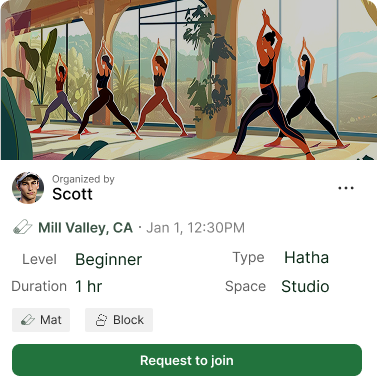
Yoga
Style type
Experience Level
Environment Preference
Climbing
Trust/safety
Difficulty ratings
Equipment expectations
Running
Pace
Mileage
Route preference
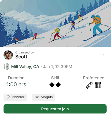
Ski/Snowboard
Skill level
Riding Style/Vibe
Session duration
2 defining the User Experience
Research revealed that successful meetups depended on more than shared interests, users needed confidence that an activity matched their skill level, expectations, and social preferences. To reduce friction and make connection feel more natural, I focused on designing an experience centered around clarity, trust, and low-pressure interaction
Designing for Low Pressure Connection
Problem: People wanted friendship without the pressure of “matching” or awkward messaging.
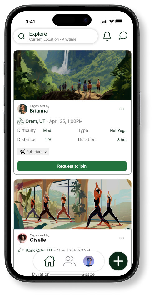
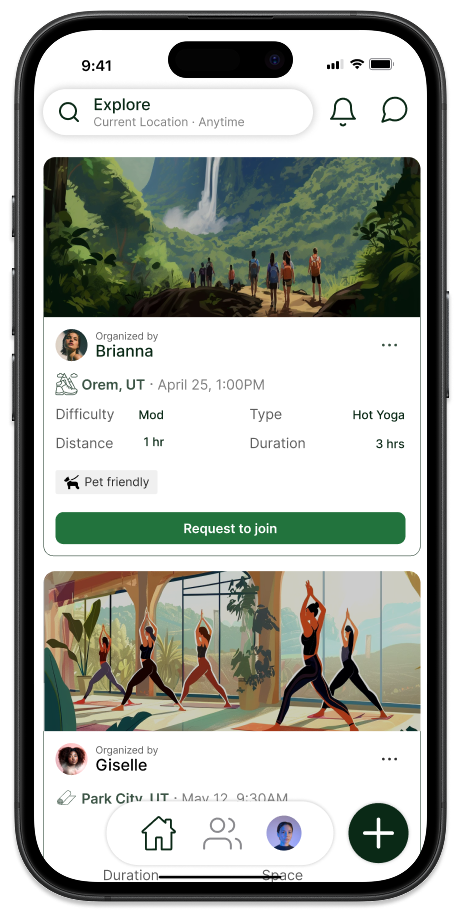
Design decision: Make activities the center of interaction. The home page is designed so users can scroll through pre-made plans in their area and request to join them.
Designing for Fast Scanning Through Iconography
Problem: Users want to browse many activities quickly. Reading paragraphs = friction.
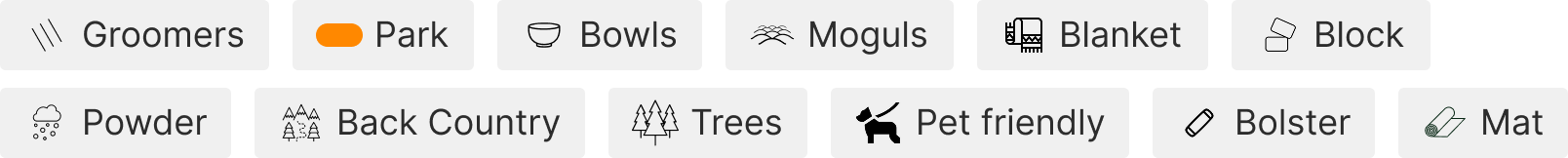
Design decision: Create a visual language through iconography where all activity type and tags have icons where expert users can quickly identify what they are looking for.

Creating Compatibility Through Activity MEtadata
Problem: Shared interests alone weren’t enough.
i.e. A beginner runner and marathoner ≠ good match.
Design decision: Surface expectations upfront with detailed activity cards that cover all the details uncovered by the expert interviews
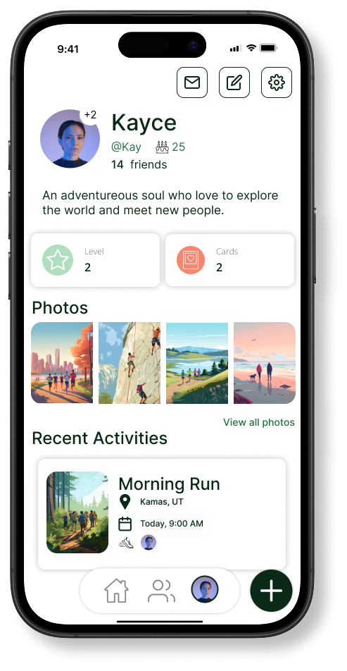
Designing for Trust & Credibility
Problem: Meeting strangers IRL creates uncertainty.
Design decision: Introduce trust signals on user profiles like XP and cards earned. Allow users to post photos of past activities on community boards
3 iteration & Product Improvement
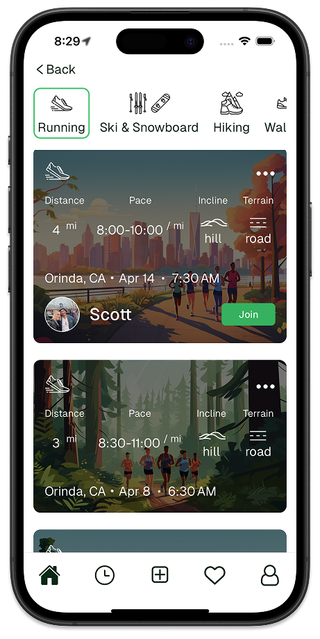
1. Improving Card Readability & Accessibility
Problem: Activity cards were visually engaging but difficult to scan quickly, with important details competing against imagery.
Iteration: We redesigned the card layout to improve hierarchy, spacing, and readability, prioritizing key information like location, pace, duration, and difficulty.
Outcome: Improved scanability, accessibility, and usability across devices and environments.


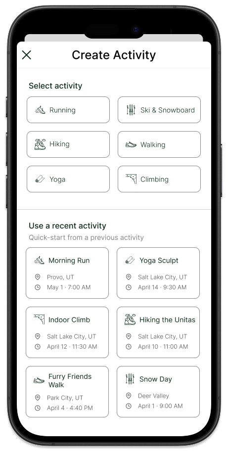
2. Reusing Previous Activities as Templates
Problem: Users creating recurring activities had to rebuild plans from scratch each time.
Iteration: We introduced a “Use Recent Activity” option, allowing users to duplicate previous events and edit details as needed.
Outcome: Faster activity creation and reduced friction for repeat organizers.
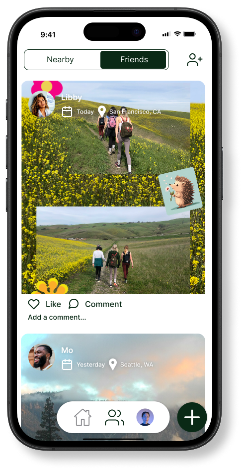
3. Pairing Down Navigation to Prioritize Community
Problem: Early navigation diluted focus and made engagement pathways unclear.
Iteration: Navigation was simplified to Home, Community, and Profile, elevating the Community page as a primary destination rather than a secondary feature. While the Home page remained focused on discovering and joining activities, the Community space became the hub for continued engagement beyond individual events.
Outcome: Reduced cognitive load, strengthened product identity, and encouraged engagement beyond activity planning.
4 Reflection
What I learned
One of the biggest takeaways from this project was recognizing the importance of prioritization. As new feature ideas emerged, it became clear that designing for simplicity often meant making intentional tradeoffs, focusing on core user needs before expanding functionality. This led to a stronger emphasis on meaningful social engagement rather than feature overload.
Join Me also reinforced the importance of thinking beyond individual screens. Accessibility, navigation, and interaction decisions all contributed to shaping a more cohesive community experience.
Beyond Design
Beyond UX design, I had the opportunity to contribute to marketing efforts and speak directly with potential users. These conversations became one of the most validating parts of the project, many people immediately connected with the idea and expressed excitement about a platform designed to help build local, activity-based communities.
While Join Me ultimately did not secure funding, investor feedback reinforced the viability of the concept. The challenge was less about product potential and more about the scale of investment required for community-based platforms. This experience reinforced an important lesson: strong user demand and meaningful problems can exist even when business realities delay execution.
Future Directions
Future iterations focused on expanding Join Me’s community features to encourage continued in-app engagement beyond individual activities. Planned additions included recurring activity groups, invite lists for quickly organizing friends, and community-driven features like leaderboards and shared collages.
As the platform grew, these community features were also intended to support a longer-term monetization strategy through optional premium tools for organizing groups and enhancing social participation. The focus, however, remained on building community value first before introducing paid experiences.